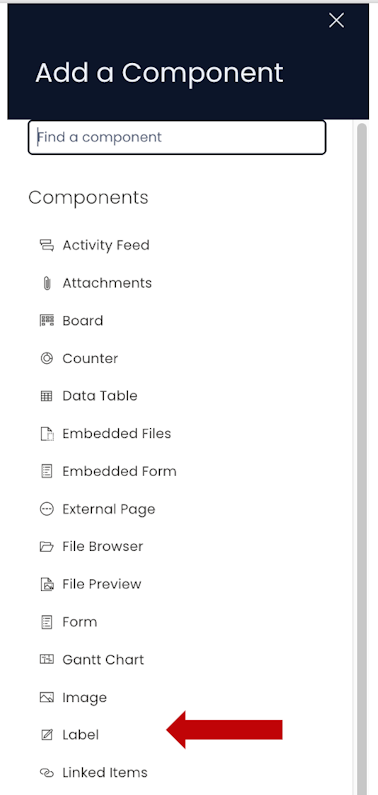
Label
Label component overview
Imagine you have four components stacked on a Grid Layout or there have been a bunch of fields in the Form component. You want to give more context to the information.
This is where the Label component is useful. A Label component is like a text tag that can be placed to organise a bunch of information on the page and provide more context for interpretation.
How to set up Label component on a Layout / Page
-
You can add the Label component on to the Layout / Page. The Label component is not present anywhere by default.

-
If the Label component is on a Grid Layout, you can resize and move the component over the layout.
-
You can set the visibility of Label on the Details breakpoint.

-
You can set the visibility of Label on the Create Screen breakpoint.

How to set up Label component on a Form
- Just like adding Label component to the Layout, you can add it within the Form component as well.
Please refer to the below video for illustration:
- Similar to Label on Grid Layout, you can move and resize, set visibility over Details breakpoint and Create Screen breakpoint.
Please note:
- The Label component is ideally used for putting up label text for a few words. You cannot press Enter and put multiple lines of text in the Label. However, you can write text in a single line.
- There no Edit (pencil) icon to configure the Label component, as this component doesn't have any settings to define behaviour of the component.